*This post may contain affiliate links for which I earn commissions.*
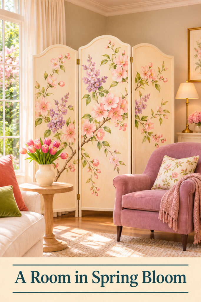
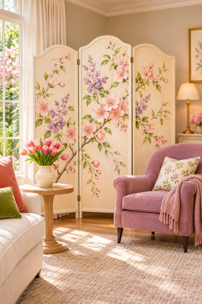
A painted floral screen turns this living room corner into a spring scene. Pink blossoms, lilac flowers, and fine green stems spread across three pale panels behind a mauve chair. Tulips on a small wooden table repeat the colors at a lower height.
The screen carries most of the decorative change. Curtains, seating, rug, and lamp create the surrounding layers without needing to repeat flowers on every surface. You could borrow this approach when you want a generous seasonal feature and prefer to keep the main walls as they are.
This image was created with AI as decorating inspiration.
What Makes the Floral Screen Work
The pale background connects the screen with the curtains and sofa. That shared color lets the painted branches spread across a large area without making the corner feel divided into unrelated blocks. Mauve upholstery repeats one of the flower colors in a quieter, solid form.
The panel edges and hinges give the painting a visible structure. You can see that this is a movable screen rather than wallpaper or an outdoor view. Its gentle folds also create changes in light across the artwork, adding depth without more objects.
The low table and tulips bring some of the floral detail forward into the seating area. A warm metal lamp provides another height, but it stays visually simpler than the painted flowers. The screen remains the main feature of the room.
Find Floral folding screens
Browse current Amazon options that can help you recreate this look.
Browse Floral folding screens on Amazon →As an Amazon Associate I earn from qualifying purchases.
Key Pieces for This Spring Seating Scene
A Stable Decorative Folding Screen
Choose a screen designed to stand in the arrangement and location you intend. Check its open footprint, panel widths, hinges, and care guidance. A three-panel screen uses more floor depth when folded for stability than its flat measurements may suggest. Keep that real footprint in mind before planning nearby furniture.
A Botanical Design With Open Background
The image gives flowers and branches plenty of pale space between them. That keeps the artwork readable behind seating. A very dense print may create a different, busier effect. Look at the whole screen rather than judging only a close flower detail.
One Related Upholstery Color
The mauve chair picks up the painted lilac and pink without trying to match every bloom. You can use an existing chair and choose a screen that relates to it. The useful connection is one repeated color, not a requirement to replace the main seating.
A Quiet Supporting Sofa
The cream sofa edge provides a pale companion to the more expressive chair and screen. If your sofa has a pattern, consider whether a quieter screen design would make the room easier to read. The surrounding furniture should leave the artwork enough attention.
A Small Table and Simple Flowers
A modest wooden table gives the chair a useful surface. The tulips connect the painted spring scene with a three-dimensional arrangement, but a small number of stems can be enough. Choose the vessel and placement so the flowers don’t hide the screen’s lower panels.
Soft Window Fabric and Warm Light
Long pale curtains frame the daylight without adding another strong pattern. A shaded lamp supports the inviting room atmosphere later in the day. Keep light and fabric arranged according to the actual equipment’s requirements and preserve access to window controls.
Position the Screen Before Adding the Chair
Start by checking the screen’s intended standing position. Follow its instructions for panel angles and support rather than flattening it to make the painting wider. A screen that looks broad in a photo still needs a stable real arrangement.
Leave enough room behind and beside it for normal use of the space. Don’t block a doorway, window operation, radiator, or route through the room. A quiet corner can be a better choice than an area where people regularly pass close to the panel edges.
Look at the painted composition from the main entrance. Some screens have a stronger central motif, while others spread the detail evenly. Decide which parts should remain visible once the chair is added. Moving the screen slightly may reveal a blossom that would otherwise disappear behind upholstery.
Place the chair where it feels connected to the screen without pressing against it. You should be able to sit, stand, and move around the seat normally. The screen is a decorative backdrop, not a support for the chair or anything resting on it.
Add the side table within useful reach and check the room from a seated position. The artwork should still feel present without looming awkwardly over your shoulder. Keep the tabletop practical enough for the way you use that chair.
Repeat the Colors Without Repeating Every Flower
Choose a small number of colors from the screen to carry forward. Mauve on the chair and pink in the tulips are enough to connect the main layers. Green can appear in a modest cushion or the flower stems without becoming a new dominant color.
If you already own floral cushions, compare their scale with the painting. A smaller print can work as a supporting detail, but a second large blossom pattern may compete with the screen. A plain cushion is a useful alternative when the corner already has plenty of detail.
The pale rug gives the furniture a shared area and lets the colors stand out. Use a rug that fits the seating arrangement and normal movement through the room. Its texture can add interest even when the color remains quiet.
For a smaller living room, use fewer surrounding accessories rather than crowding them around the screen’s feet. Keep the chair, one useful table, and a clear path. The painting already supplies a large amount of spring detail.
A different wall color can change how the pale panels read. Test the relationship in ordinary room light before choosing a screen finish. Warm cream may feel connected to a beige wall, while a cooler white can stand apart more sharply than expected.
Consider storage if the screen will be seasonal. Check how it folds and where it can stand safely when not in use. A decorative feature is easier to enjoy when bringing it out and putting it away doesn’t require rearranging the entire home.
Shop Similar Pieces
Look for Floral Folding Screens
Compare the full design, panel construction, intended standing arrangement, and open footprint. A printed image and a textured painted finish can look different in person. Check what the listing actually describes rather than assuming the surface was hand painted.
Shop Similar Plain Accent Chairs
Use your existing seat when it works with the palette. If choosing another, consider comfort, dimensions, and the room’s walking routes before matching the flower color. A related muted hue can connect the scene without being exact.
Add a Simple Wooden Side Table
Look for a stable base and a top large enough for ordinary use beside the chair. A quiet finish helps the screen remain the main feature. Check the table’s height against the seat rather than judging from the room image alone.
Look for Modest Spring Flower Vessels
A plain cream jug or vase can support a few tulips without another strong shape. Choose an opening that suits the stems and a stable base for the table. Keep the finished arrangement low enough to leave the painted panels visible.
Final Styling Tip
Cover the flowers on the side table with your hand and look at the corner again. If the screen and chair still feel connected, the main color relationship is working. Treat the real or faux stems as a finishing layer rather than something required to hold the scene together.