*This post may contain affiliate links for which I earn commissions.*
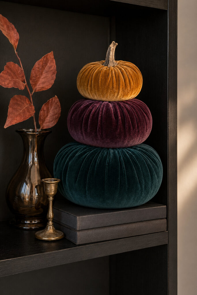
A stack of plush velvet pumpkins gives this compact shelf vignette all the presence of a much larger fall display. Deep teal, dark plum, and warm ochre create an unexpected seasonal palette that feels rich without relying on traditional orange.
The arrangement is deliberately simple. Three graduated pumpkins form the central tower, while charcoal books lift the stack and give it a strong base. A smoked-glass vase, rust-colored leaves, and a small antique-brass accent complete the shelf without competing with the velvet.
The dark bookcase is an important part of the effect. Its nearly black finish intensifies the jewel tones and allows the pumpkins’ ribbed texture to catch the soft side light.
This is an especially useful decorating idea for a bookcase, narrow console, office shelf, built-in cabinet, or any small surface that needs a distinctive fall focal point.
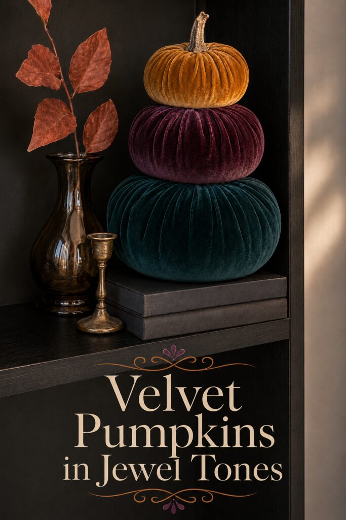
The inspiration image for this decorating idea was created with AI.
Why the Three-Color Stack Works
The pumpkin colors follow a clear progression. Deep teal creates the broad, weighty base. Plum forms a slightly smaller middle layer, and ochre finishes the stack with a warm seasonal note.
Each color is strong enough to be noticed, but the shades share similar depth and softness. That connection prevents the stack from looking like three unrelated decorations.
The repeated velvet texture also unifies the arrangement. Light catches the raised ribs differently on each pumpkin, giving the simple shapes more dimension.
Around the stack, the supporting pieces use quieter finishes:
- Charcoal provides a structured foundation.
- Smoked glass adds subtle reflection.
- Rust leaves supply an organic fall detail.
- Aged brass introduces a restrained metallic accent.
Choose Velvet Pumpkins in Graduated Sizes
The stack depends more on proportion than exact color matching. Begin with a wide, low pumpkin for the bottom. The middle pumpkin should be noticeably smaller, while the top pumpkin can be compact enough to preserve the tiered silhouette.
Avoid using three pumpkins with identical widths. Without a clear reduction in size, the display may look bulky rather than gracefully stacked.
Soft foam or fabric pumpkins are preferable to ceramic ones. They are lighter, less likely to damage one another, and easier to stabilize.
Look for pronounced vertical ribbing and a rich, non-shiny velvet surface. A realistic brown stem adds an organic touch and prevents the finished tower from feeling too formal.
Build the Palette One Pumpkin at a Time
A perfectly coordinated three-piece set may be difficult to find. Combining pumpkins from different sets can produce a closer match and give you more control over the final sizes.
Start with teal because it covers the largest area. Look for a dark blue-green rather than turquoise. The color should appear almost black in the deepest folds.
The middle pumpkin can range from aubergine to wine or dark plum. Avoid a vivid purple with cool blue undertones, which may feel disconnected from the warm ochre top.
For the smallest pumpkin, consider mustard, ochre, camel, or antique gold. This warmer shade draws the eye upward and ties the stack to the rust leaves and brass accent.
The pumpkins do not need to match the inspiration exactly. Preserving the combination of one deep green, one dark berry tone, and one warm golden shade will create the same overall effect.
Elevate the Stack With Charcoal Books
Two charcoal books or book-shaped boxes raise the pumpkin tower and separate the velvet from the dark shelf.
The books also introduce straight horizontal lines beneath the soft, rounded forms. This contrast makes the composition feel more intentional.
Use hardcover books with plain dark jackets, fabric-covered decorative boxes, or storage boxes shaped like books. Turn printed spines toward the wall if the lettering distracts from the palette.
Keep the stack low. Two books are enough to provide elevation without making the vignette too tall for the shelf.
Before arranging the pumpkins, confirm that the shelf and books can support the combined weight. Lightweight foam pumpkins are the most practical choice for this type of elevated display.
Add a Smoked-Glass Vase
A narrow smoked-glass vase sits beside the pumpkin stack. Its reflective surface prevents the dark corner from looking completely flat while preserving the vignette’s moody palette.
Choose gray, brown-black, or translucent charcoal glass. The vase should be tall enough to balance the pumpkin tower but narrow enough to fit comfortably beside it.
A softly curved bottle shape complements the rounded pumpkins. Ribbed glass can also work, although a heavily patterned vessel may compete with the velvet’s vertical channels.
Leave some open space between the vase and pumpkin stack. That small gap helps each element remain visible against the dark background.
Use Rust Leaves as a Slim Vertical Accent
A few long rust-colored leaves extend above the vase and introduce an unmistakable fall detail. The sparse arrangement is more effective here than a large bouquet.
Choose one branch with several substantial leaves or combine two narrow stems. Bend them so some leaves face forward and others turn slightly to the side.
Muted terracotta, copper, cinnamon, and dark rust will complement the ochre pumpkin. Avoid mixing in too many green leaves, since the teal base already provides the cooler note.
If the stems are too full, remove several leaves. The goal is to add height and movement while leaving the dark background visible around them.
Finish With One Aged-Brass Accent
The small brass candlestick provides a warm glint without making the shelf overtly metallic. Its narrow shape also fills the low space between the vase and book stack.
Choose antique brass, bronze, or aged gold rather than a mirror-like finish. A timeworn surface suits the soft velvet and smoked glass.
A petite candlestick, small brass bud vase, or sculptural metal object could serve the same role. Keep the piece lower than the pumpkins so it remains a supporting detail.
If adding a candle, use a short flameless taper. Open flames should never be placed near velvet pumpkins, artificial leaves, books, or enclosed shelving.
Keep the Stack Stable
Place the largest pumpkin squarely on the books and check that its base does not extend too far beyond their edges. The pumpkin should feel supported rather than balanced on a narrow platform.
Center the plum pumpkin over the teal base. The upper pumpkin can be placed slightly forward or backward if needed to compensate for an uneven stem or base.
Small pieces of removable mounting putty or clear exhibit gel can help stabilize lightweight decorations. Test the product on an inconspicuous area first, especially when using it near velvet, paper, painted surfaces, or porous book covers.
Avoid placing the stack on a shelf that is frequently bumped or accessible to young children or pets. If it cannot be made reliably stable, display the pumpkins side by side in a graduated cluster instead.
Give the Vignette Enough Breathing Room
The arrangement feels polished because it occupies only part of the shelf. The dark background and open space around the objects are part of the design.
Do not fill the remaining shelf with several additional pumpkins or small signs. The stack already provides the seasonal statement.
A shelf opening with approximately twice as much height as the book-and-pumpkin tower will feel spacious. On a shorter shelf, omit the books or use only two pumpkins.
This same composition can also work on a console. Place the tower toward one side, then position the vase and brass accent beside it while leaving the opposite end relatively open.
Find Jewel-Toned Velvet Pumpkins
Look for soft pumpkins in deep teal, plum, and ochre. Buy them individually or combine several multipacks to achieve the right colors and proportions.
Add Charcoal Decorative Books
Use two understated books or storage boxes to lift the stack and provide a structured visual base.
Include a Smoked-Glass Vase
Choose a dark translucent vase with a narrow profile and softly curved form.
Arrange a Few Rust Leaves
One or two sparse branches are enough to add height and connect the palette to the fall season.
Introduce an Antique-Brass Detail
A small candlestick or similarly scaled metal accent adds warmth without distracting from the velvet.
Stabilize the Tiered Display
Use a removable, surface-safe stabilizing product where necessary and keep the finished tower away from frequently disturbed areas.
Final Styling Thought
Treat the pumpkin stack as a small sculpture. Once its proportions and colors feel balanced, add only the few supporting pieces needed to frame its shape and emphasize the velvet texture.